Project: Class Registration for PowerSchool
Team
UX Designer
UX Writer
UX Researcher
Product Manager
Team of Engineers

My Role
Qualitative Research
Conceptualization
Design
Usability Testing
Dev handoff
Problem & Background
Focus area - navigation
July 7, 2025
Scope
Time line of 1 Month
Use design system components as much as possible
Redesign to improve UX
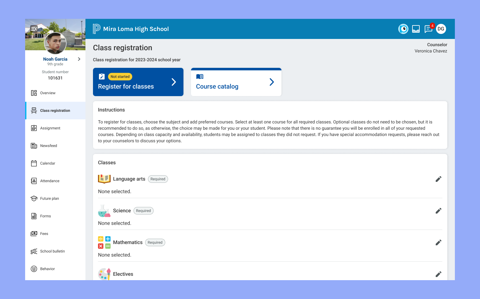
Every year, students or their guardians sign up for their classes next year in PowerSchool’s My Power Hub portal.
However, the existing experience was unintuitive and time consuming.
It forced users to select into each course category and select options from a modal page, close it, and select another course category until all the selections have been made.
Our users
As students and guardians, they want:
apps that are easy to navigate
intuitive experiences
leverage technology to alleviate mental load
be as time efficient as possible
My first focus area was on how to handle navigating to the course categories to make the selection process simple.

To efficiently explore design patterns, I used AI tools to gather examples of how similar workflows are handled in other applications. One recurring solution was the use of a stepper component to guide users through a multi-step process with automatic progression.


Then, I looked at the page where this all starts - I wanted a single launch point to jump into the work and start selecting the classes.
At the same time, I wanted to keep that table-like view available, so the user could easily see the categories they will need to select courses for, and see their selections easily if they’ve made any.
Though some iterations, I landed on a design where the user has a large call to action at the top of the page, the instructions under the buttons, then a view similar to what we had in the original, but laid out in a visually appealing way that was still easy to scan.
The idea was the user would be able to select the category from this page as well, allowing them to jump into a specific section if the wanted. It would allow for easy quick editing as well, or if they wanted to go over the options again with a counselor or guardian.
Other improvements
With the updated navigation structure, the process felt much more fluid and like a modern application, built to assist the user complete the task at hand.
But, we were far from done. There were many aspects to this workflow that we could improve. Next on our list was:
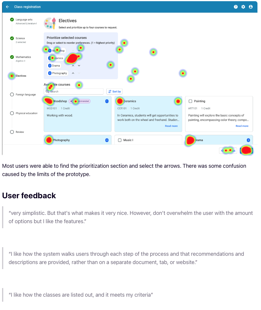
Incorporating AI to provide recommendations to students
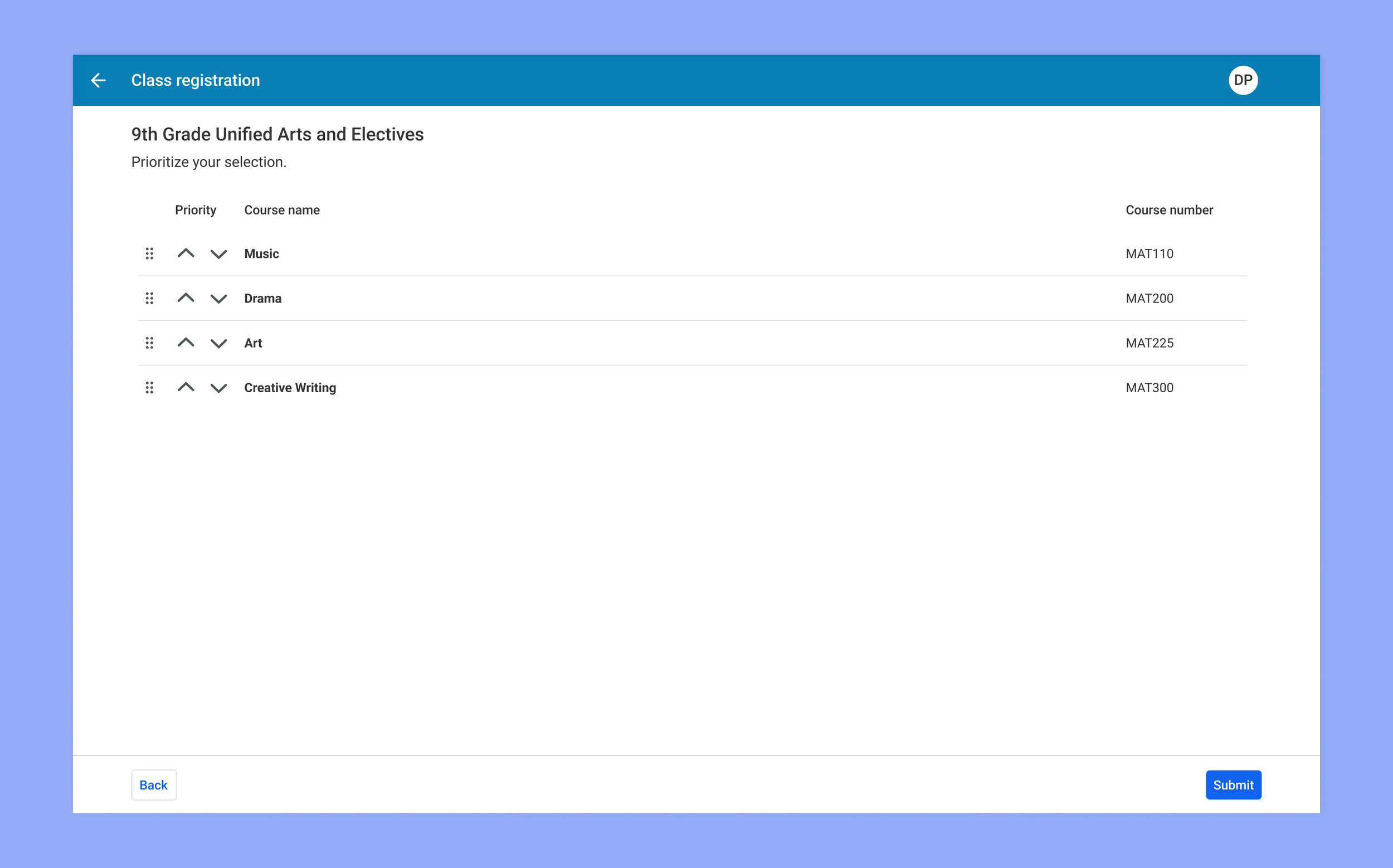
Providing a way to prioritize when a class allows multiple selections
Improving the course catalog feature

These old page designs were sterile - not ideal for an application students would be using, and could use improvements.

In the new design I added in an illustration to add some personality and playfulness to the page, as well as some color and visual interest.
The change wasn’t only visual either. Users could now see the options and prioritize their choices at the same time. This would avoid scenarios where users would have to navigate back and forth to make changes in their selection.
Users could also edit their priorities by selecting and de-selecting options in addition to using their keyboard controls and the arrow buttons provided.
We also leveraged AI to provide recommended courses based on information we had on the student. We could predict what course would be a good fit based on prior courses they have taken, take their personal interests into account, and even look at what colleges or careers they expressed interest in, and personalize our recommendations to them.

The course catalog is a place where students and guardians can browse all the courses provided by their school. They may be simply browsing for looking for a specific course in mind. From here they can look at the prerequisites for each course and plan accordingly with their school counselor.
In the new design, we replaced the table layout with our card layout. Users could now favorite courses from here, which could inform the AI when recommending courses during the selection workflow.
Research
Research
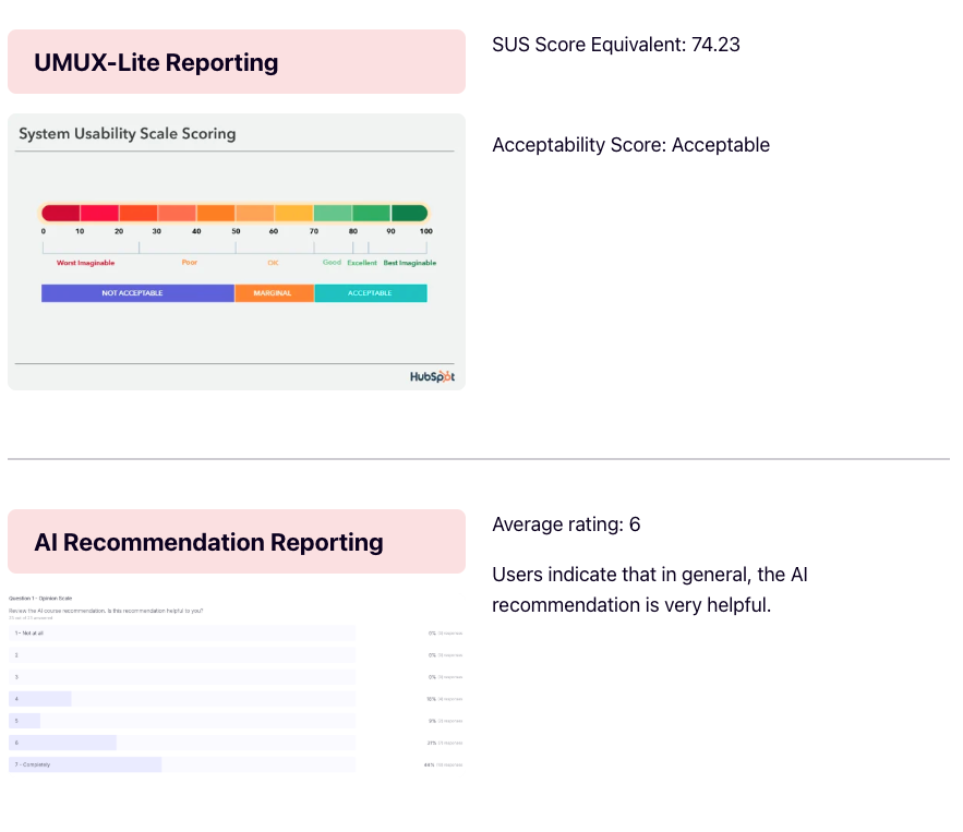
Earlier on in my iterations the I put the concepts to the test with a usability study with 22 high school students.

We asked the students to go through the pages as if they were registering for their courses. The were asked to go to the mathematics page, select an option, then move on to the next step. In the following page, they would be asked to prioritize items they selected for electives.
Then the students answered a few questions about the feature’s ease of use and value it provided. The following are our findings, with a 74.23 System usability score, and an average rating of 6 out of 7 for leveraging AI to recommend classes.